Kia’s New Logo: A Fresh Mark …But Does It Work?
When a global automotive brand like Kia decides to rebrand its logo, there are big stakes: recognition, heritage, readability, and relevance all come into play. With its unveiling of a new logo in 2021, Kia took a bold step. The question: Does this bold step pay off? In my professional-content-writer view, the short answer is: yes, in concept—but with significant caveats in execution. Let’s dive deep.
Why Kia changed the logo
There are good business and design reasons behind the change:
-
The previous Kia logo – the red oval with “KIA” in capital letters – was very recognizable, but also fairly conventional, and arguably starting to feel dated in the fast-moving electrified/SUV era.
-
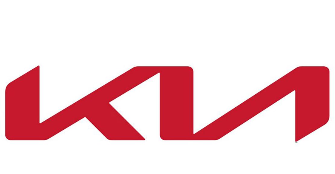
Kia wanted to project a more modern, ambitious identity. According to discussions of its brand strategy, the new mark is meant to reflect “symmetry, rhythm, rising motion” – essentially, movement and modernity.
- The new logo better aligns with contemporary trends of minimalism, geometric forms, and digital/EV branding. As noted by design analysts, the new mark is “a simple, geometric, silver shape spelling out ‘Kia’.”
So, on paper, Kia’s intent seems valid: update the brand identity to match the evolving market and vehicle lineup. But the execution is where things get interesting and controversial.
What works with the new logo
Here are the strong points:
-
Modern aesthetic
The new design certainly looks more contemporary. The letterforms are slick, with a continuous flow connecting the letters. It gives a “futuristic” feel, which aligns with Kia’s push toward EVs and advanced mobility.
-
Removing legacy baggage
The old red oval, while iconic, carried a lot of legacy connotations and maybe didn’t reflect the brand’s next chapter. The removal of the oval and the shift to more minimalism frees Kia to reposition itself.
-
Potential for versatility
In digital usage, badge usage on EVs, signage, and global markets, simpler geometry can be more versatile. The new logo’s flatter, sharper lines may scale and adapt better across media. This is a plus for a brand with global ambitions.

What doesn’t work (or works less well)
However, there are real issues that limit the logo’s success:
-
Legibility and recognition problems
Some users have pointed out that the new mark is harder to read, and confusingly, many people saw “KN” instead of “KIA”. For example:
“I just saw it for the first time. I thought it said KN.” Reddit
And analysis sites note the spike in searches for “KN car” after the logo’s release.
For a logo, instant recognition is a key requirement and this stumbles here.
-
Abrupt departure from brand history
Brands often evolve their logos rather than completely replace them, preserving continuity so customers still feel “this is the same brand I know”. According to one expert commentary: “The new logo represented a significant departure … It lacked continuity with the brand history.”
For a mass-market brand like Kia, that drop in continuity can matter.
-
Loss of distinctive symbol or logomark
While the wordmark is the main feature, the new design loses a distinct, separate “icon” (something you can use on merchandise, hats, car grille alone) that the red oval provided. One critique states: “It still leaves Kia without a logomark, a distinct image or symbol used to represent the brand even without the word.”
A strong logomark helps when you have limited space, monochrome printing, or want brand recognition without reading text.
- Over-minimal and risk of a generic look
The design’s drive toward minimalism is understandable, but in doing so, it runs the risk of looking too generic another chrome badge among many. KIA design commentary stresses that while minimalism is in vogue, it must retain character and distinction.
My Verdict: Is it “any good”?
Yes – but with reservations. Here’s a balanced take:
- Strategically, Kia made the right move: the world of automotive branding is changing. To remain relevant and appear future-facing, updating the logo makes sense.
-
Visually, the new logo has strong merits: clean lines, modern feel, better suited for digital/EV future.
-
Practically, however, it has some missteps: legibility issues, loss of immediate recognition, and weaker brand-continuity.
If I had to grade, I’d say the new logo is a B+. It passes, it advances the brand, but it’s not a standout “A” in branding design because of the execution issues. For Kia to fully benefit, it will need time for the new mark to embed in public consciousness, and possibly further tweaks (or supporting iconography) to bolster recognition.
Final word
When a global brand like Kia refreshes its logo, it’s more than just a design update it’s a bold declaration of innovation, creativity, and future-driven thinking. The 2021 redesign wasn’t just a facelift; it was a clear message that Kia is ready to lead in the age of modern mobility and intelligent design.
 A Symbol of Progress and Innovation
Kia’s new logo captures the essence of motion, connection, and forward momentum. The sleek, continuous lines of the design represent innovation without interruption symbolizing how the brand moves seamlessly toward a more electric, connected future.
The transformation also reflects Kia’s shift from being a traditional carmaker to a mobility-focused tech brand. It’s clean, confident, and truly representative of modern minimalism a trait every strong brand and designer strives for.
A Masterclass in Modern Aesthetic
The new Kia logo is a case study in simplicity done right. The geometric strokes and unified flow create a sense of precision and clarity. It’s bold yet elegant, futuristic yet approachable perfectly balancing form and function.
Design experts praise the logo for being adaptable across platforms, from vehicle badges to digital interfaces. This flexibility makes it ideal for global branding consistency a challenge every design professional understands well.
Lessons for Web Design & Brand Identity
At Texas Design Studio, we see Kia’s rebranding as a perfect parallel to modern website design and development.
Just like Kia streamlined its logo to communicate clarity and innovation, websites today must deliver clean design, intuitive navigation, and visual identity that instantly resonates with their audience.
The Kia redesign reminds us that every design element—from typography to spacing—should convey purpose and emotion. Whether it’s a car emblem or a website interface, design must tell a story.
What Makes It Work So Well
-
Readability Meets Style – The continuous flow of the letters gives a futuristic look without losing readability.
-
Memorability – The sleek, symmetric lines stick in viewers’ minds, making the brand easily recognizable.
-
Digital-Ready – The logo scales beautifully across digital, print, and physical mediums—just like a well-developed responsive website.
-
Emotional Connection – The upward motion in the typography evokes positivity, confidence, and progress—qualities essential in modern branding.


